
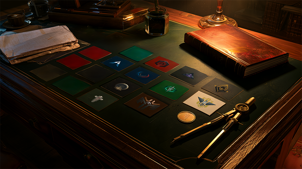
Sci-Fi Faction Design: What Medieval Heraldry Knew That We Forgot
Using 800 Years of Visual Grammar to Build the Factions of the Future
In 1200, a knight had about three seconds to identify friend from enemy on a battlefield. No radio, no HUD, no comms. Just a shield, a banner, and a color.
That’s why heraldry was invented.
In 2025, we’re building factions for Sol Fracta, a TTRPG set in the 30th century — and I just spent a week working through the same problem those medieval heralds solved with hammers and dye.
The problem was embarrassingly obvious once I saw it
Three factions had ended up in the same visual neighborhood: Horizon Syndicate, Deep Society, and Pharmacopolia Universalis were all sitting somewhere in the grey/black/white spectrum. Not by intention. By drift. Each individual palette decision had made sense in isolation. Together, they were a mess.
Put them side by side on a colony sheet and they blur. A player glancing at the table during a session shouldn’t have to think about which marker belongs to which faction. That’s cognitive overhead that should go toward decisions that matter.
The fix required a framework. So I went back to the oldest one we have.
The heraldic grid, briefly
Medieval heralds developed a remarkably tight system over a few centuries. It breaks down like this:
Metals: Or (gold), Argent (silver). Colors: Gules (red), Azure (blue), Vert (green), Sable (black), Purpure (purple). Furs: Ermine and its variants. (Less relevant here, but they exist.)
The fundamental rule, the one that survived 800 years, the constraints that shaped Sol Fracta’s sci-fi faction design are older than the genre: no metal on metal, no color on color. A gold symbol on a silver field is illegible from distance. A red symbol on a blue field loses contrast. The rule isn’t aesthetic preference — it’s functional engineering for visibility at 50 meters while someone is trying to kill you.
The secondary principle that falls out of this: scarcity is identity. Every charge, tincture, and ordinary that one faction uses becomes unavailable as a primary identifier for another. The system forces distinction by construction.
Running the 10 factions through the grid
Starting with what was already locked in helped clarify the problem. The Holy German Empire had claimed Black/White/Gold before I’d thought about the grid at all — and it’s a perfect heraldic triple: black (Sable) and white (Argent, a metal) and gold (Or, a metal). Borderline on the two-metals front, but historically grounded and visually unambiguous.
Ordo Crucis: Crimson/White/Gold. Red on white is textbook heraldic — maximum contrast, religious weight, unmistakably militaristic. This one needed no adjustment.
Then the problem trio.
Horizon Syndicate became White/Steel Blue/Cyan. White reads as Argent (metal), steel blue as Azure (color). Metal plus color is valid. The palette says space, distance, cold technology. A faction that thinks of itself as the vanguard of human expansion should look like it belongs to the void.
Deep Society got Violet/Black/Pale Gold. Violet (Purpure) is rare in the full set, no other faction uses it as a primary. That’s deliberate. The society operates in the margins of power, in initiation and secrecy, and its color should feel slightly wrong, slightly off the established spectrum. Pale gold keeps it from reading as flat darkness. Legitimate royalty hiding behind its own obscurity.
Pharmacopolia Universalis took Emerald Green/White/Silver. Green is the universal cross-cultural signal for medicine, biology, the living world. The white and silver add corporate coldness to what could otherwise feel naturalistic. This is a faction that monetizes life without sentiment, the palette should carry both signals simultaneously.
The remaining factions fell into place: Aurum Collective in Gold/Ivory/Silver (two metals, deliberate exception for the luxury faction, if anyone gets to break the rule, it’s the people whose entire identity is excess). New Northern Republic in Red/Blue/Silver. Merco Prime in Earth/Dark Grey/Black. Code Cartel in Steel Grey/Blood Red (kept from the original logo, the vertical split between grey and red is load-bearing to the lore).
10 factions. 10 distinct dominant colors. Zero collision.
The worldbuilding decision inside the design decision
Here’s where it gets interesting.
Medieval heraldry is a product of its constraints: limited pigments, battlefield distances, illiterate armies that needed to read allegiance by color and shape. Those constraints no longer exist in the 30th century.
So should the factions of Sol Fracta follow heraldic logic at all?
My position: yes, and not just for design pragmatism.
The logic of “maximum contrast for rapid identification” doesn’t go away when the battlefield becomes a colony sheet or a political negotiation across three star systems. Humans still need to pattern-match allegiance quickly. The medium changes — it’s not a shield at 50 meters, it’s a logo on a colony structure, a uniform in a crowd, a faction marker on a resource tracker. The cognitive problem is the same.
What does change: the symbolic language. In the 12th century, Azure meant loyalty and truth because the culture said so. In the 30th century, what does violet mean? What does teal carry? That’s a worldbuilding question, not a design question. Different cultures colonizing different planets over centuries will develop their own heraldic traditions, their own symbolic vocabularies. The grammar I’m using for Sol Fracta is a 21st century designer’s intuition about what reads as distinct and legible, which is itself a historical artifact.
The 30th century will have had another thousand years to develop its own conventions. That’s a lore thread worth pulling.
What the grid forced that I wouldn’t have reached alone
The constraint did something I didn’t expect: it made me validate silver.
My first instinct with Pharmacopolia had been “grey” — clinical, corporate, cold. The heraldic grid has no grey. It has Argent, which is silver, which is a metal. That’s not the same thing. Silver has luminosity, prestige, a different visual weight than flat grey. Calling it Argent and treating it as a metal rather than a neutral changed how I thought about the faction’s visual identity. They’re not grey. They’re polished.
That’s the kind of forced precision a grid provides that open-ended brainstorming doesn’t.
The factions of Sol Fracta are meant to be immediately readable. A player who’s never read a line of lore should be able to pick up a colony sheet and start building intuitions about who controls what, who’s in conflict, where the tensions are — just from color distribution. That’s the goal. Heraldry got there first, 800 years ago, by necessity.
We got there by borrowing their homework.
When you build sci-fi faction design for a worldbuilding project — TTRPG, novel, game — do you work with a visual identity system from the start, or does it emerge after the lore is already written? Does the visual ever end up shaping the lore, or does it always feel like the reverse?
SOL FRACTA // IN DEVELOPMENT
Join the Future Signal.
No release date yet. But when something moves — you’ll know first.

 English
 French
Leave a Reply